
In this 5-week engagement, I worked to improve an internal app for Constellation Brands, a Fortune 500 beverage alcohol corporation. Our goal was to design a product that would create a meaningful connection between their employees and their company’s products. Throughout the project, I interviewed users, conducted competitive analysis, and came up with different concepts– one of which shaped the foundation for our final solution.
Our client, Constellation Brands (CBI), is a leading beverage alcohol producer and marketer, with a portfolio that includes over 100 brands across wines, beers, and spirits. They approached us to redesign their internal-facing CBI Ambassador app, which was currently a minimum viable product spun off their internal sales platform.
The purpose of this internal-facing app, as defined by our client, was to allow employees to “act like owners.” By encouraging employees to interact with CBI products in their daily lives, employees would ideally form a personal connection to their products and brands, and gain a deeper understanding of them.
With the client’s main goal clearly established, we wanted to learn how employees interacted with the Ambassador app, and more importantly, how they engaged with CBI products.
From our user interviews, we discovered that while sales employees tended to be power users that used Ambassador as a supplement to their suite of sales apps, general employees were much less familiar with it. Our team aligned to focus on general, non-sales CBI employees, who were the exact audience our client wanted to target and turn into "brand ambassadors."
We synthesized our user research, which revealed the following key insights:
It was clear from our research that employees were willing to interact more with CBI products in their personal lives, just not through Ambassador, which they found unreliable and unintuitive to use. A director at CBI described the experience:
“I used it for a while, but I couldn't understand it… and then finally when I was trying to interact with it, I went to a place and they didn't have our brand. So I kind of lost faith in it and stopped.”
We needed to understand what employees would actually be using to engage with CBI products.
We analyzed several competitors to learn more about the different types of apps that competed for the attention of CBI employees.


After learning how general employees engaged with CBI products, and what apps they were using instead of Ambassador, we created a persona to represent our users, and help us better empathize with them:

We then created a journey map to capture Olivia’s current experience with Ambassador:

Olivia needed to be able to find locations that carried CBI products, and quickly learn about these products in different contexts, such as food pairings while out at a restaurant.
We developed a problem statement that would serve to address Olivia's major pain points by combining her need to discover CBI products with the experiences in her day-to-day life:
CBI employees need a digital way to discover CBI products in order to seamlessly integrate these products with experiences they are searching for, thereby cultivating a meaningful connection between their personal lives and the products they represent.
We found that there were 3 unique ways to approach CBI product discovery based on our problem statement: product-first, experience-first, and a combination of both.


My teammates and I sketched our ideas and then created paper prototypes to best represent each of these approaches:

I created a paper prototype that would provide users with a CBI product-centered experience with a focus on useful product information. Users would directly discover CBI products, learn about them, and easily find locations that offered the specific products they want to consume.

Our team’s experience-first concept was much like Google Maps for CBI employees, helping users quickly discover nearby restaurants, bars, and stores. After identifying a location that fit the type of experience they were searching for, they would then find out what CBI products the place had.
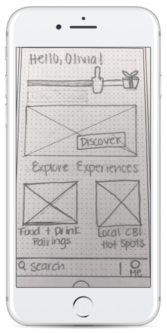
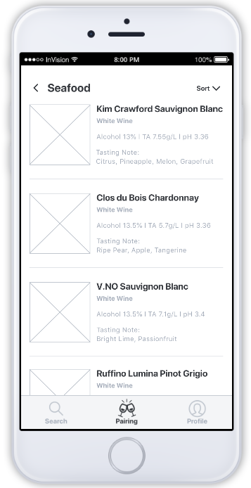
This concept balances CBI products with experiences to discover. The home screen features product-based rewards, experiences to discover, and an extensive food and beverage pairing functionality. Users can find what CBI beverages pair well with their food, or vice versa.
We performed two quick rounds of concept tests to better understand what was the most meaningful way to integrate CBI products with everyday experiences.
In our first round of testing, we were able to narrow down to our product and experience-led concepts. While users found the pairing-focused concept interesting and nice-to-have, they didn’t see pairing as a priority compared to finding CBI product information and locations. We realized we could integrate pairing as a feature in each of the first two concepts.


We made iterations and then created mid-fidelity screens to further test our two concepts in more detail, which received mixed feedback in the first round. Our goals were to make a final decision on whether to focus on a product-first or experience-first approach, and take what worked well in each concept.
I continued working on the product-first approach, considering more deeply how to provide useful information. A key feature I added was crowdsourced taste tags at the product level– crowdsourcing would allow employees to engage further with the app, while providing key taste information that CBI might not have on hand:


We also refined our experience-first approach, with a focus on determining appropriate experience categories (e.g. location, occasion, and meal types), which we achieved through a card sorting exercise:


Through our second round of testing, we learned that:
We ultimately decided to use the product-first concept as a foundation for Ambassador, while adding the ability to find products by the types of experiences. Finally, we removed the extensive map functionality entirely to reduce confusion, and instead added integration with external maps (e.g. Google Maps, Apple Maps).
Our final prototype allowed employees to discover CBI products based on where they are, and the things they want to do:
We received positive results in our final round of testing– users rated the prototype easy to use at 4.0/5, and we received even higher satisfaction ratings across the board, averaging 4.4/5. One CBI employee said the app still seemed user-friendly even to someone with low tech proficiency:
“I think if [the app were] live, it seems very user-friendly, and it doesn’t seem like something, especially for someone like me who is extremely IT-challenged, would have difficulty with.”
This was encouraging to hear, since it seemed like, given some time and onboarding, ease of use would further improve.
Our usability test results helped us form a few future recommendations that we believed would further improve Ambassador as next steps:
Overall, our client was excited about the prototype. I was happy to hear that they highlighted the crowdsourced taste tags as a key feature, and that it was something they could implement. They also mentioned that a map view was currently the current home screen by default, rather than a product-based view. The new layout would require further exploration before they'd be able to make a decision on whether they’d switch to a product-first orientation.
When we first received this design brief from our client, we knew that Ambassador was a map-based app, and we never expected that to change. However, our interviews and concept tests showed us repeatedly that an internal map wasn't a priority and that users strongly preferred to browse or search products directly.
Through this project, I learned that sometimes building a better user experience meant completely reimagining an app or website, removing any preconceived notions or constraints based on the current iteration. While we still considered the main purpose of Ambassador ("helping employees act like owners"), we let go of a key feature that only seemed essential because it was "there to begin with." I'm excited to continue thinking critically about what's really important to users, versus what's included purely based on legacy.
Resume available upon request